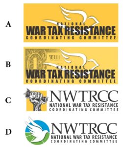
For nearly 40 years, NWTRCC’s logo has been a dove on a howitzer gun. At our business meeting on May 2, we might adopt a new logo. I have mixed feelings about moving on from the original logo, but there are compelling reasons for doing so. First, for anyone visiting our website on their phone, the dove is not discernible. If anything, the dove looks like smoke coming out the howitzer gun. Additionally, we are hoping to do a website refresh this summer and it would be good to have a logo that is in color. We had originally planned the website refresh for January, but we were told that we would need another refresh if we changed our logo in the future. So in this chicken and egg scenario, NWTRCC will save both time and money if we are certain about a logo before moving on with the website upgrade.
Following discussion at our November business meeting about the possible future of our logo, NWTRCC formed an ad-hoc logo committee. With additional input from our Outreach Committee, we proposing one of the following four options. These options are not in their final form, but are rough drafts. Our primary criteria in creating these proposals was that the new logo should be (1) simple enough to be easily discernible on a cell phone and (2) one that is in color but could also be transferred to black & white for certain printed materials.
The adoption of any new logo requires the consensus of our business meeting on May 2, 2021. Although anyone is welcome to attend this meeting via Zoom, there are normally about 30 folks in attendance. We would appreciate any feedback that would help participants at the business meeting make a decision.
You can feel free to leave any feedback as a comment on this blog post or you can actually vote for your preferred choice on our Twitter page: https://twitter.com/WarTaxResister/status/1379895452859035656. You can also contact the NWTRCC office with your opinion at 262-399-8217 or nwtrcc@nwtrcc.org.
— Lincoln Rice

I have been one in the past who has wanted to hang onto the old logo which has a bit of history. Today I find myself surprised to come down in a completely different space. If we are going to get rid of it, let’s get rid of the bird too! So I am voting for the fist with the cash! The raised fist is a strong symbol that still seems to appeal.
I like the dove on the bottom of the listed designs. Unless it is too close to some other group’s.
I like all of them, good work committee. My favorite is number 4.
Keep the rusty old gun. Color it to make it look decrepid. Please, no more dove logos.
D!
B. The graphic tells the story.
C is not easily discernable from a distance. I think D is the cleanest but it’s true that there are a lot of dove logos out there plus there’s no picture of money. So I would vote for B.