
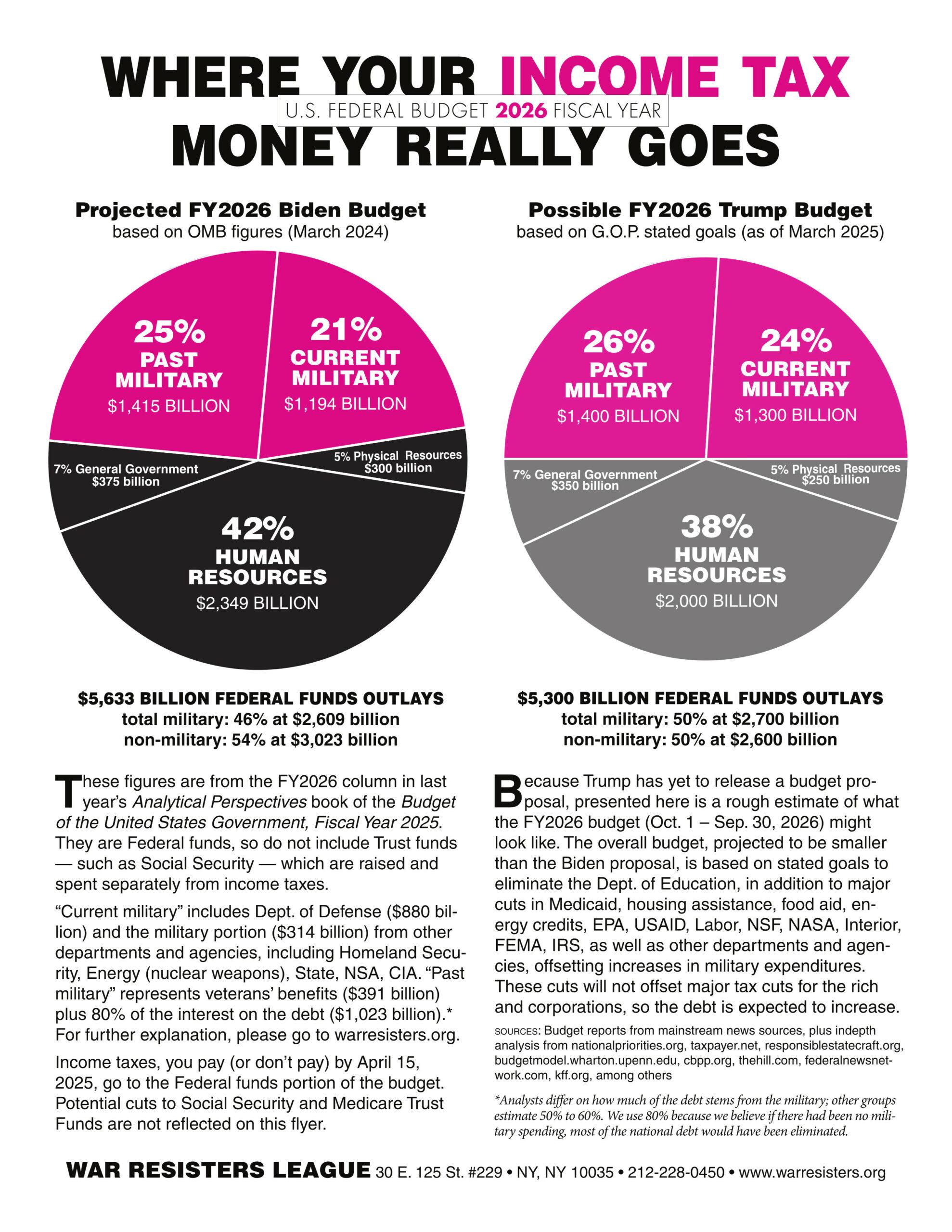
 I got all tangled up trying to write a blog about producing the WRL pie chart in light of the federal budget process chaos currently discombobulating Washington.
As so often happens with new administrations, there was no Trump budget proposal to analyze in time for our tax day flyer, just lots of bluster from the White House about firings, corruption, fraud, redundancies, and cuts to “big government” that could save taxpayers billions, but so far nothing in black and white with line-by-line budget numbers. Supposedly a “skinny budget” will be announced any day, and the full budget proposal may be out in mid-May. We’ll see.
In order to do the pie chart flyer, we had to be somewhat inventive: extrapolate the Biden projections and guess how a “Trump budget pie” might look for the fiscal year that begins October 1, 2025. As a result the pie on the left is created from last year’s draft proposal from the Biden administration for FY2026, while the one on the right projects a rough Trump budget pie based on news coverage: cuts to social programs and agencies, increases for the border, deportations, and the Pentagon.
With great fanfare (as always) Trump pledged a trillion dollar Pentagon budget boasting “Nobody’s seen anything like it.” Well, actually we have. The WRL pie chart has shown over a trillion in military spending for a few years, because we include much of Homeland Security (ICE, TSA, Coast Guard, border patrol, etc.) and militarized lines from other non-DoD agencies in the military portion of the budget pie. Even then we are probably missing billions in “black budget” shenanigans by the CIA, special forces, etc.
As you can see, our “Possible Trump Budget” pie does not show a dramatic shift. The big “savings” numbers you hear coming out of the White House and GOP are projected over 10 years. If they get what they want, the pie slices may shift more dramatically over four years, but from year to year percentage changes are less dramatic.
If you want more detail about the budget process and what it’s been looking like for years, the National Priorities Project has an explanation on their website.
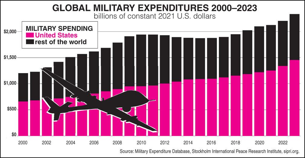
Source: Military Expenditures Database, sipri.org
The United States may be the world’s biggest spender, but the back of the pie uses text and a chart promoted by the Global Campaign on Military Spending to remind us that we have allies in this fight. Military spending is increasing worldwide, especially in Europe with governments worried about Russian aggression and the U.S. administration’s apparent disdain for traditional allies.
In advance of the campaign’s Global Day of Action on Military Spending (GDAMS) April 28, they are circulating a statement for groups to sign onto demanding that governments across the world put an end to arms racing and militarization. They’ll announce what they call their first list of signers on April 28, but the campaign will continue beyond that date.
The Global Campaign’s appeal wisely points out that “History has repeatedly shown that militarization brings neither peace nor security; it perpetuates cycles of destruction, suffering, and injustice.” Perhaps Trump’s boastful demagoguery and chaotic leadership will wake more people up to the frightful reality of world militarization. It should drive us to strengthening allies-in-resistance around the world at the same time it provides us with an excellent WTR recruiting opportunity here at home.
— Post by WRL pie chart co-author Ruth Benn
(with some helpful editing from pie chart co-author Ed Hedemann)
Thank you, Ruth and Ed! and I hadn’t heard of 4/28 action, so I appreciate learning about that too.